

Interesting facts in development
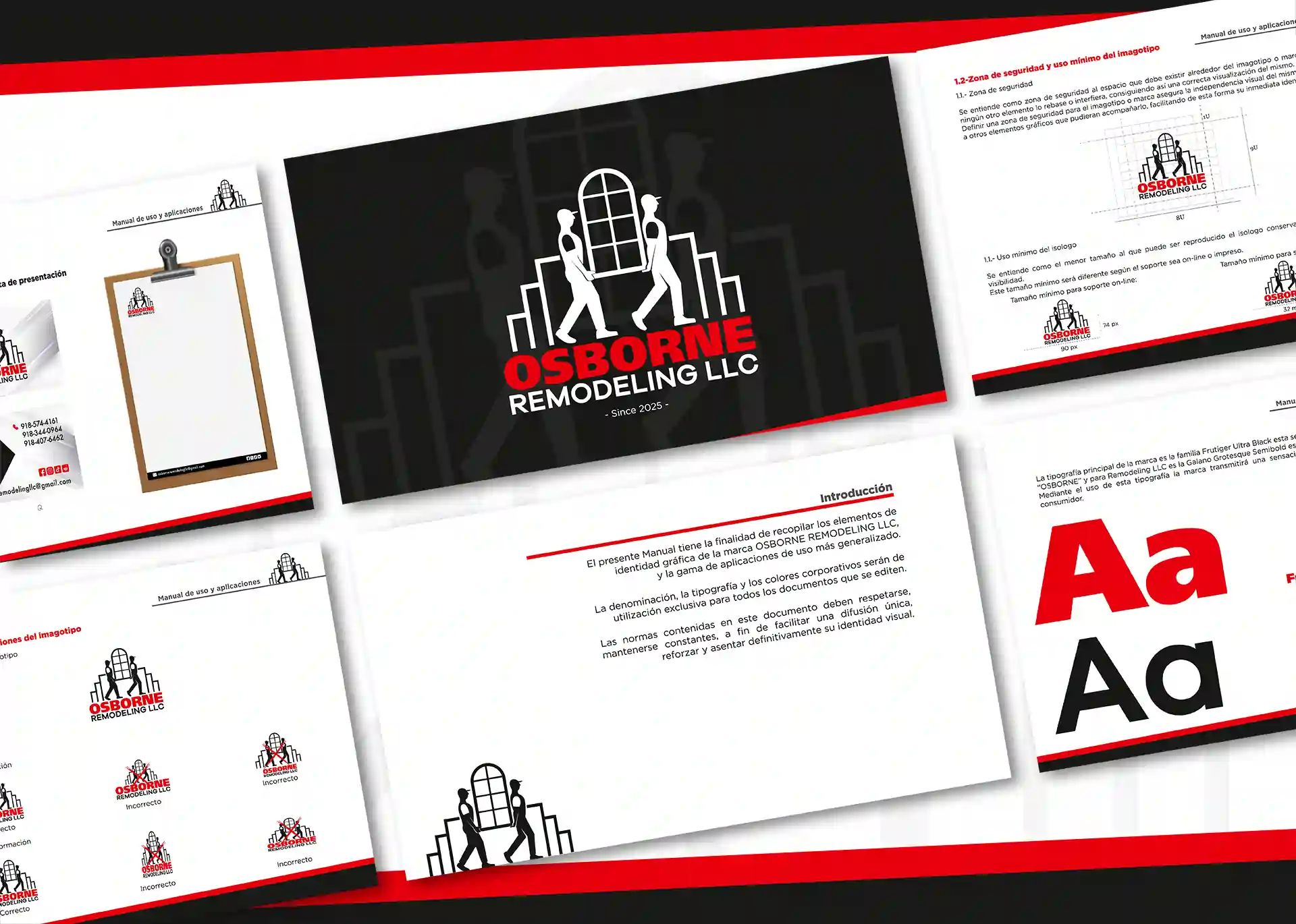
We completely reconstructed the brand’s visual system, reorganizing architectural and structural elements into a modern, clean, and functional composition. To ensure long-term consistency, we developed a comprehensive corporate brand guidelines manual covering official logo variations, clear space rules, typography, and a high-impact color palette of black, red, and white designed to communicate authority, energy, and technical expertise.
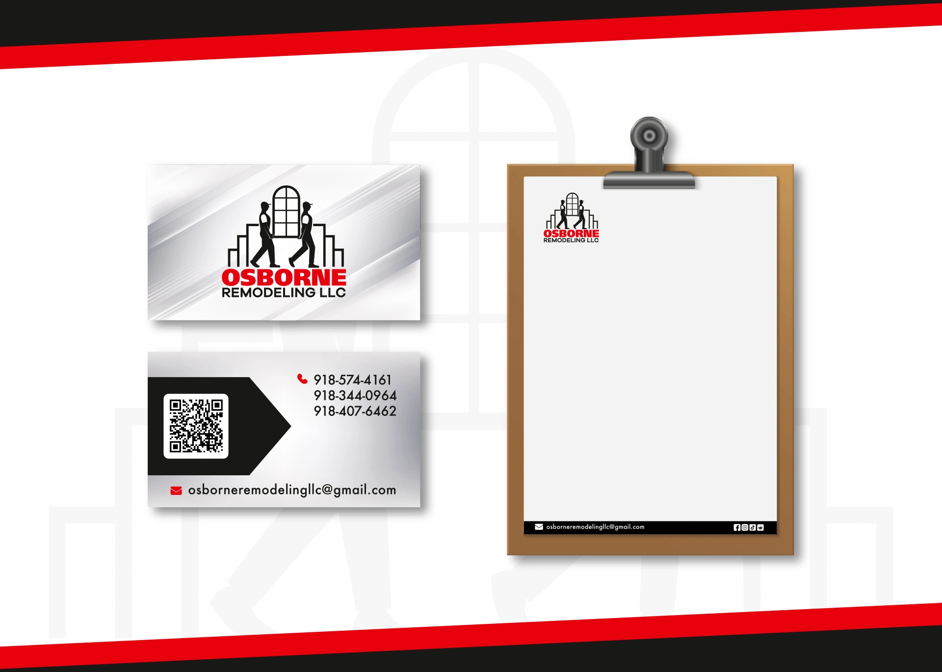
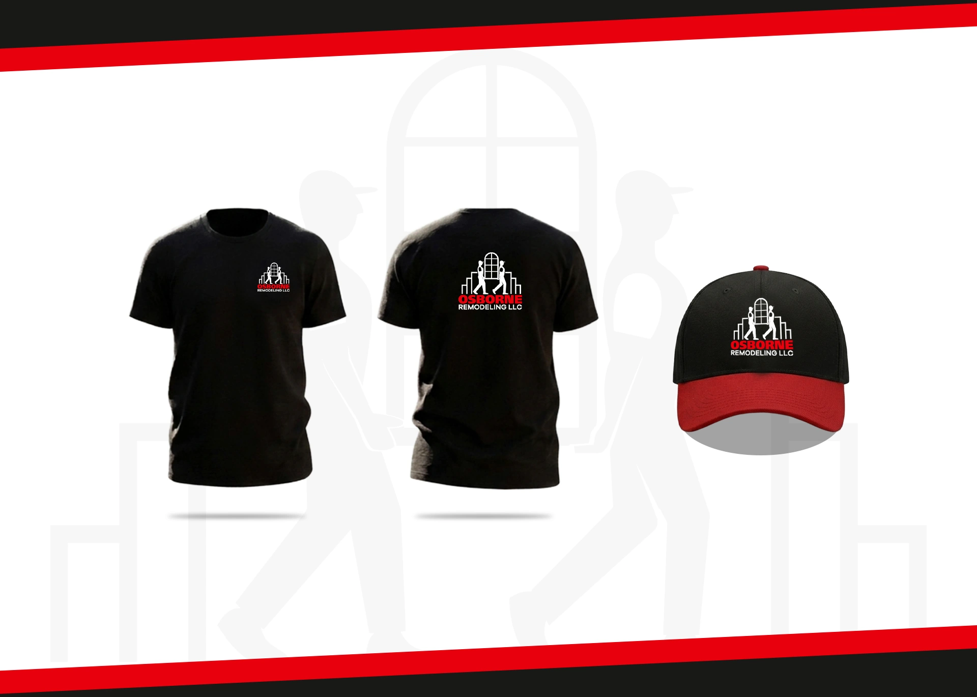
The result is a strong corporate presence that turns a former design limitation into a strategic asset: an identity fully optimized for commercial signage, vehicle wraps, uniforms, stationery, and digital media.
Interesting facts in development
What this project proves for your business:
A professional visual identity builds instant credibility and trust. Moving away from generic or unorganized visual assets ensures your company is perceived as an established, reliable, and high-level provider in your industry.
Vector optimization and structured design ensure perfect adaptability. A professionally built logo scales seamlessly across all commercial touchpoints, from digital platforms and print stationery to heavy-duty signage and apparel.
Comprehensive brand guidelines preserve brand equity and consistency. Establishing clear technical rules for logo usage, typography, and color ensures every future piece of content reinforces your company’s professional authority.

Services applied in this project:
Corporate brand identity redesign · Brand strategy & concept development · Logo vectorization & technical optimization · Brand guidelines manual · Corporate typography selection · Color palette development · Print & digital visual system setu.