Two brands, one home: where artisan bread and Venezuelan cheese become nostalgia with an address
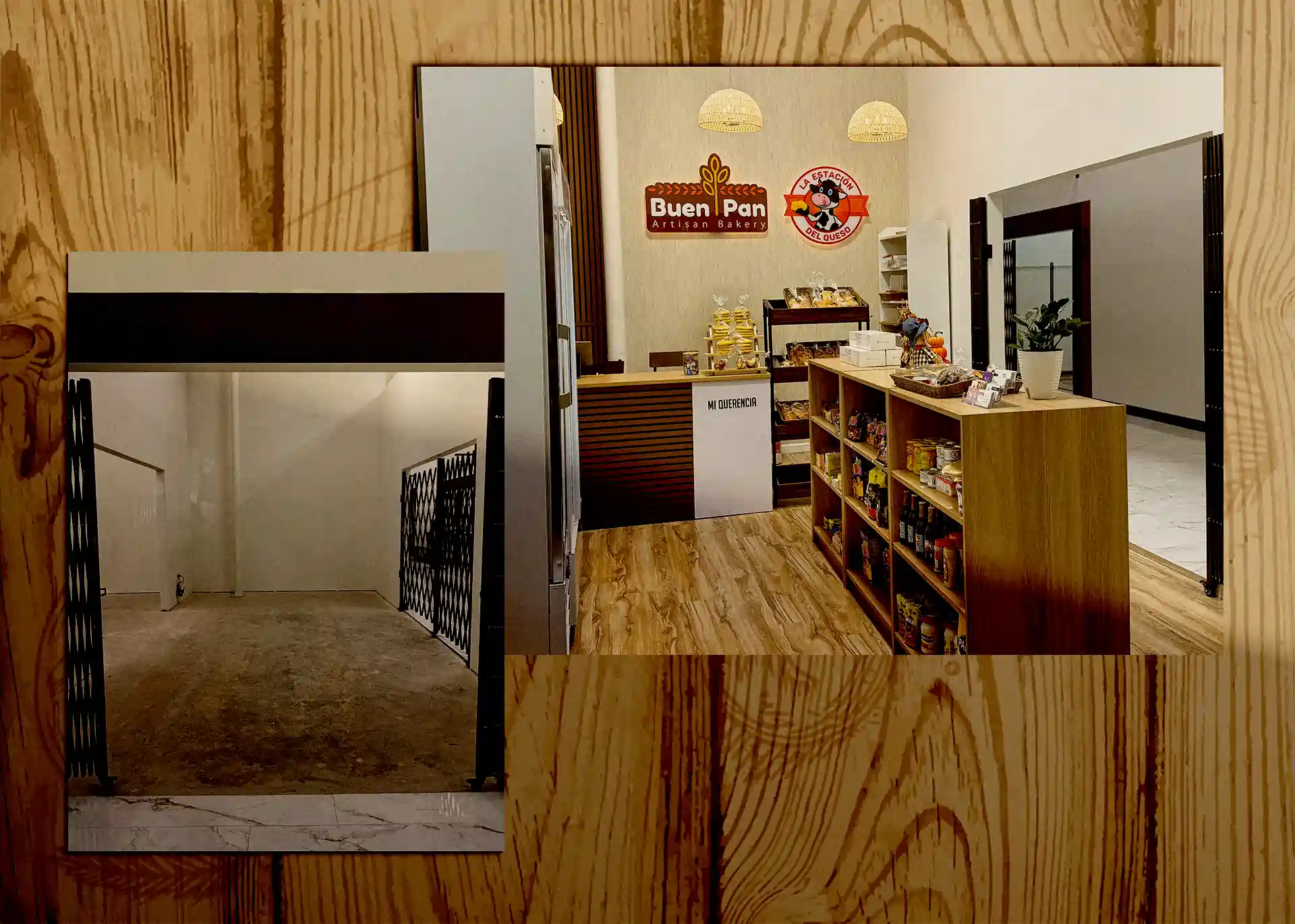
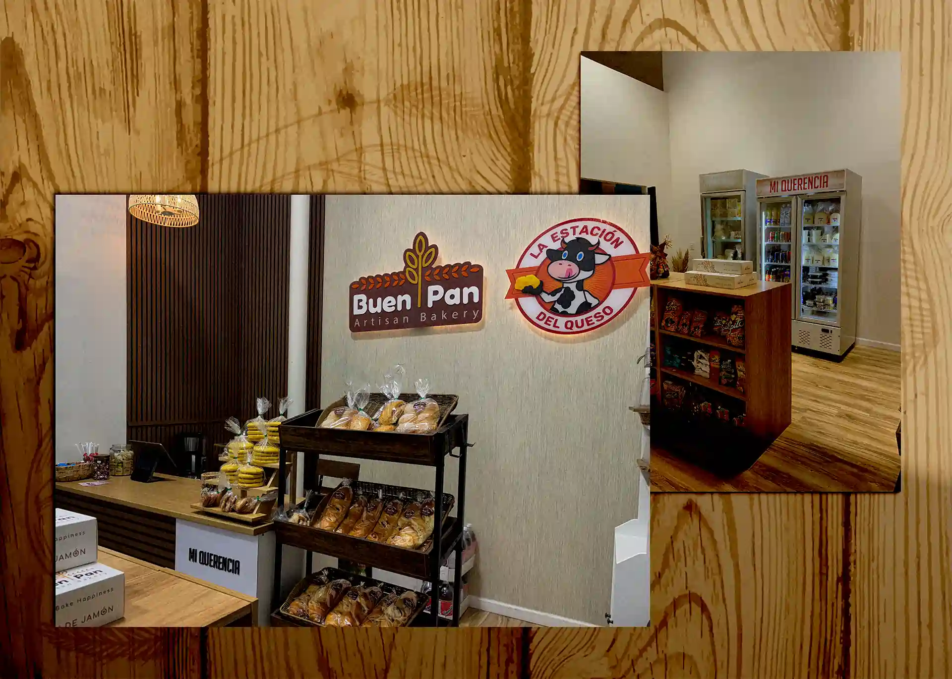
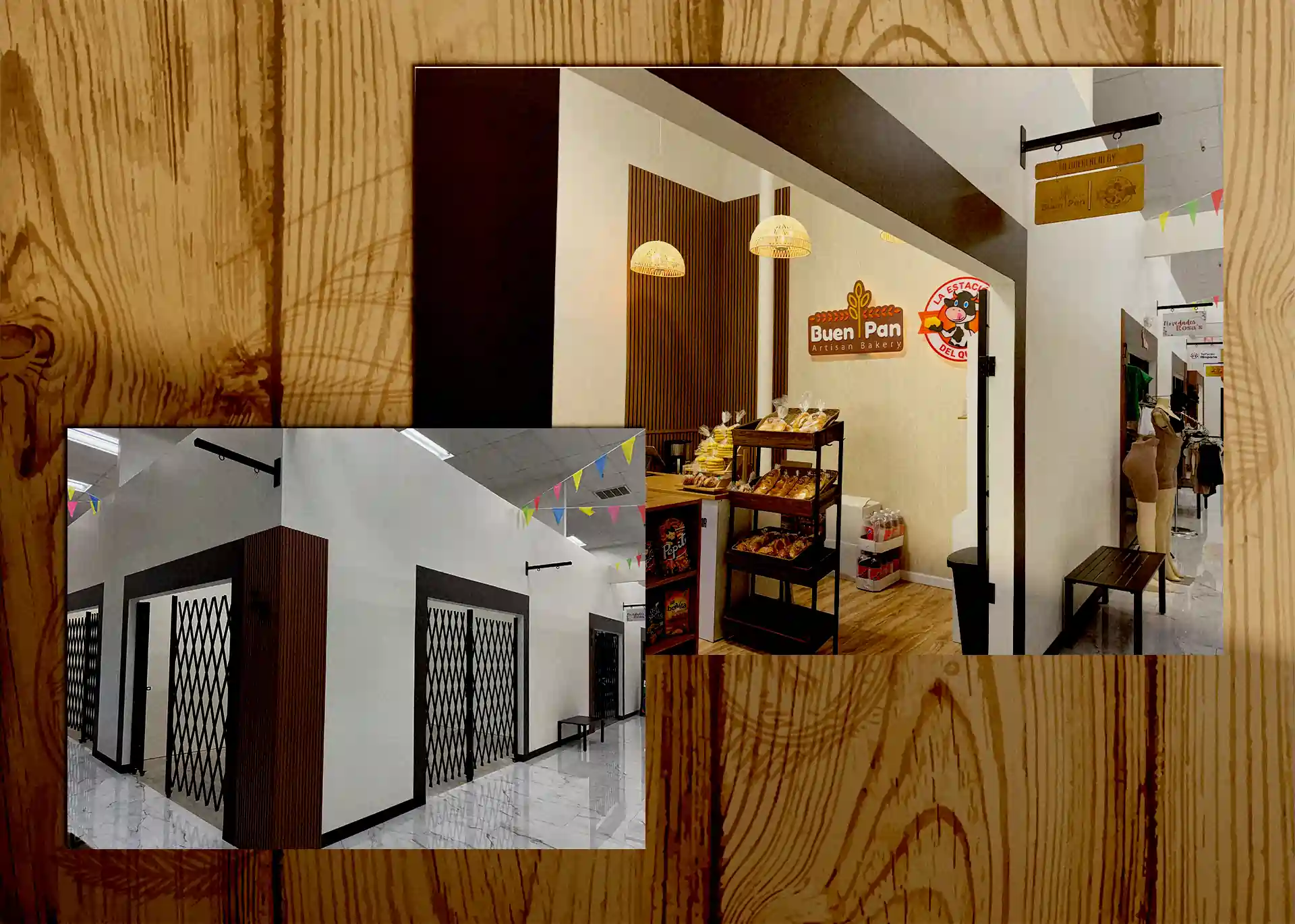
When Buen Pan and La Estación del Queso decided to come together, the challenge wasn't just opening a store, it was creating a place where Tulsa's Latino community could find the flavors of their childhood in a space that felt like home. A space that could be warm and modern at the same time, while reflecting the handcrafted nature of its core products: bread and cheese.
Category:
Commercial Space Design · Latin Mini Market & Specialty Retail
Client:
Mi Querencia: Buen Pan Artisan Bakery + La Estación del Queso
Location:
Tulsa, Oklahoma
Date:
2025
Interesting facts
in development
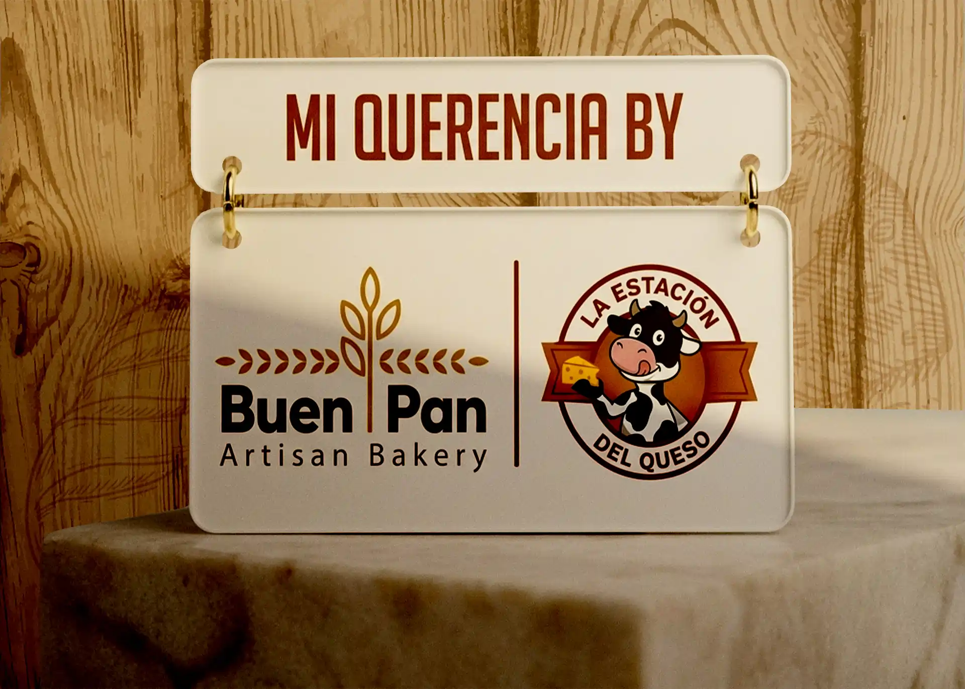
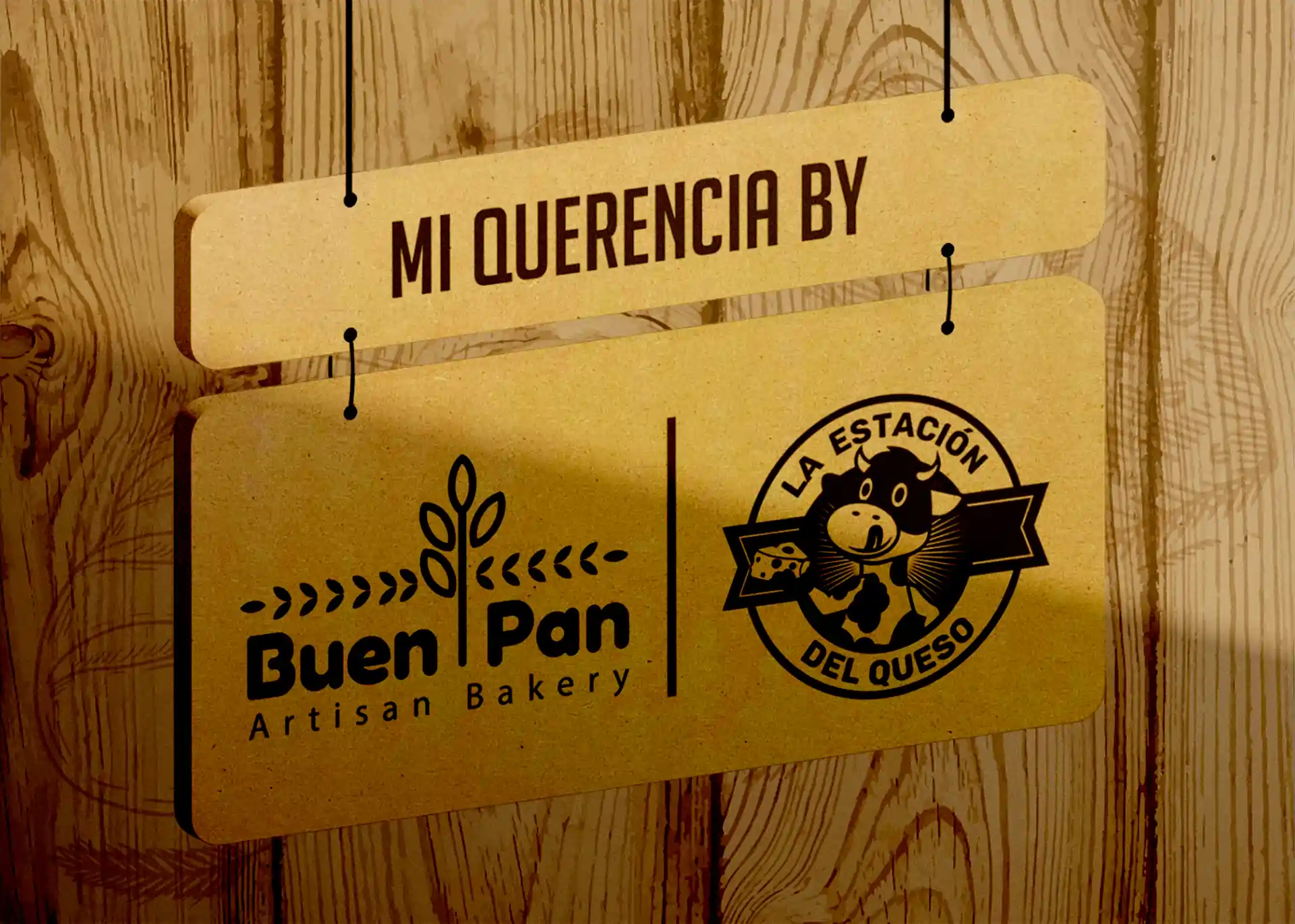
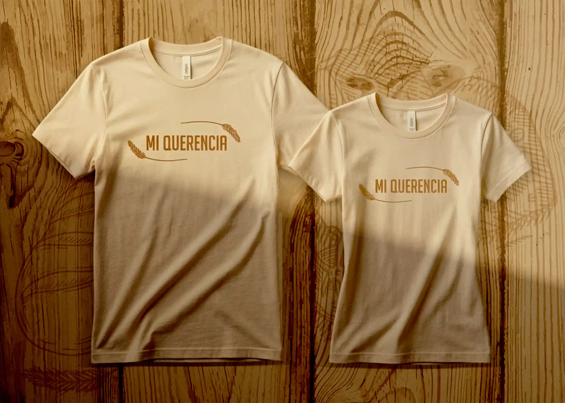
We developed the complete Mi Querencia concept from scratch: a color palette that honors both brands’ visual identities, textures that evoke the artisanal, carefully selected furniture, warm rattan pendant lighting, and graphic elements executed across multiple materials acrylic signage, laser-engraved wood signs, handcrafted name tags, and branded uniforms.
The result is a mini market unlike any other: a space that sells products, but first sells belongings.
Interesting facts
in development
What this project proves for your business:
Merging two brands doesn’t have to create confusion — it can create something powerful. We unified two distinct business identities into a single, cohesive visual concept where every detail reinforces both brands without either one losing its voice.
Materials communicate what words can’t. The wood, natural textures, and handcrafted signage tell customers something before they read a single label: the products here are authentic, made with care and with soul.
A well-designed space retains customers and builds community. Mi Querencia isn’t just a Latin grocery store — it’s a gathering point. The space design turns every visit into an emotional experience that keeps people coming back.
Services applied in this project:
Commercial concept design · Retail space design · Furniture & lighting selection · Acrylic and wood signage design & fabrication · Uniform design · Interior branding · Name tags and physical brand identity pieces.