Artisan bread with an identity that elevates the everyday
Doratta didn’t start with a logo; it started with an intention. When transforming from Deli Pan—a functional brand in a saturated category with a generic name—the challenge was to redefine the brand from its foundation and create a strategic response designed to stand out, connect, and position itself from the very first contact.
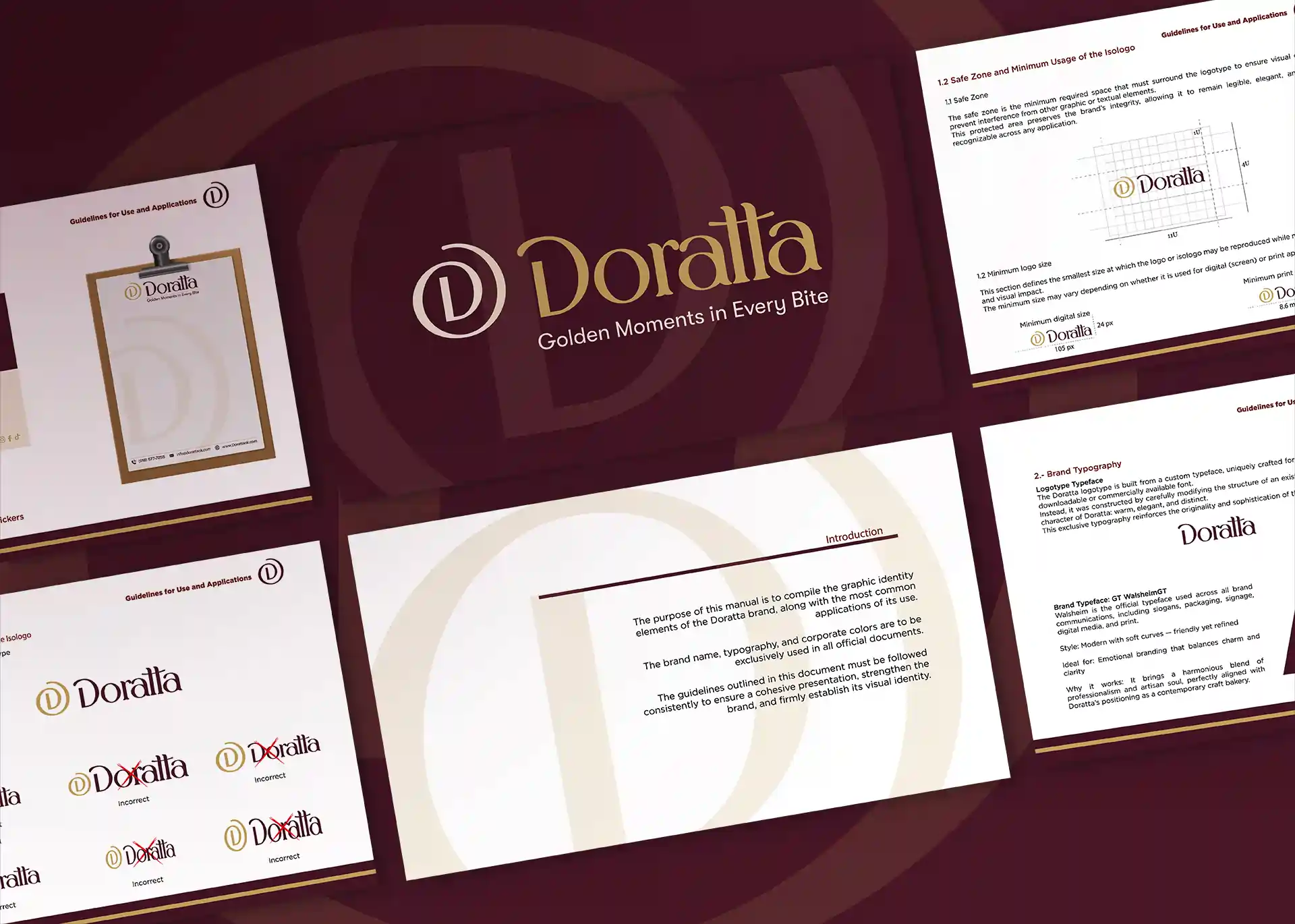
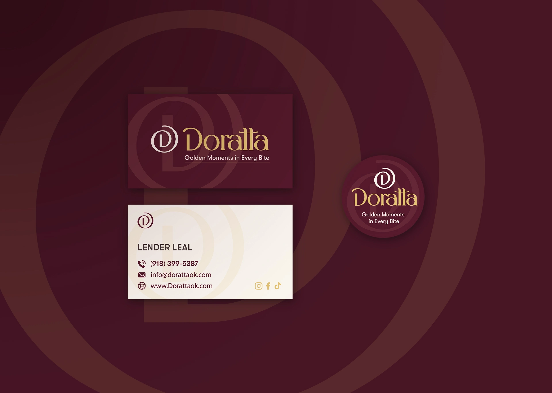
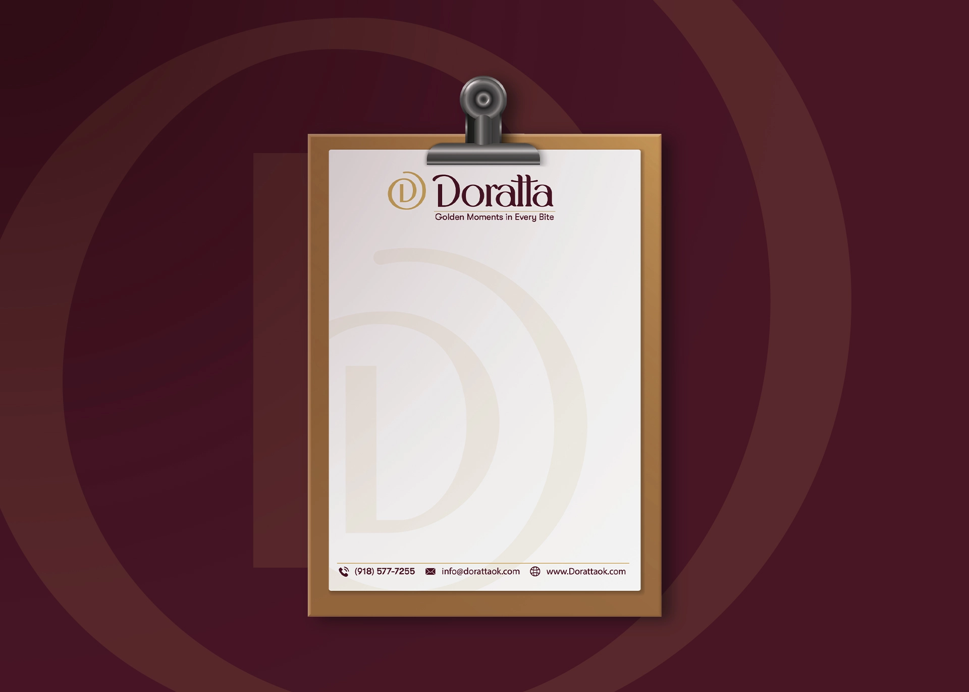
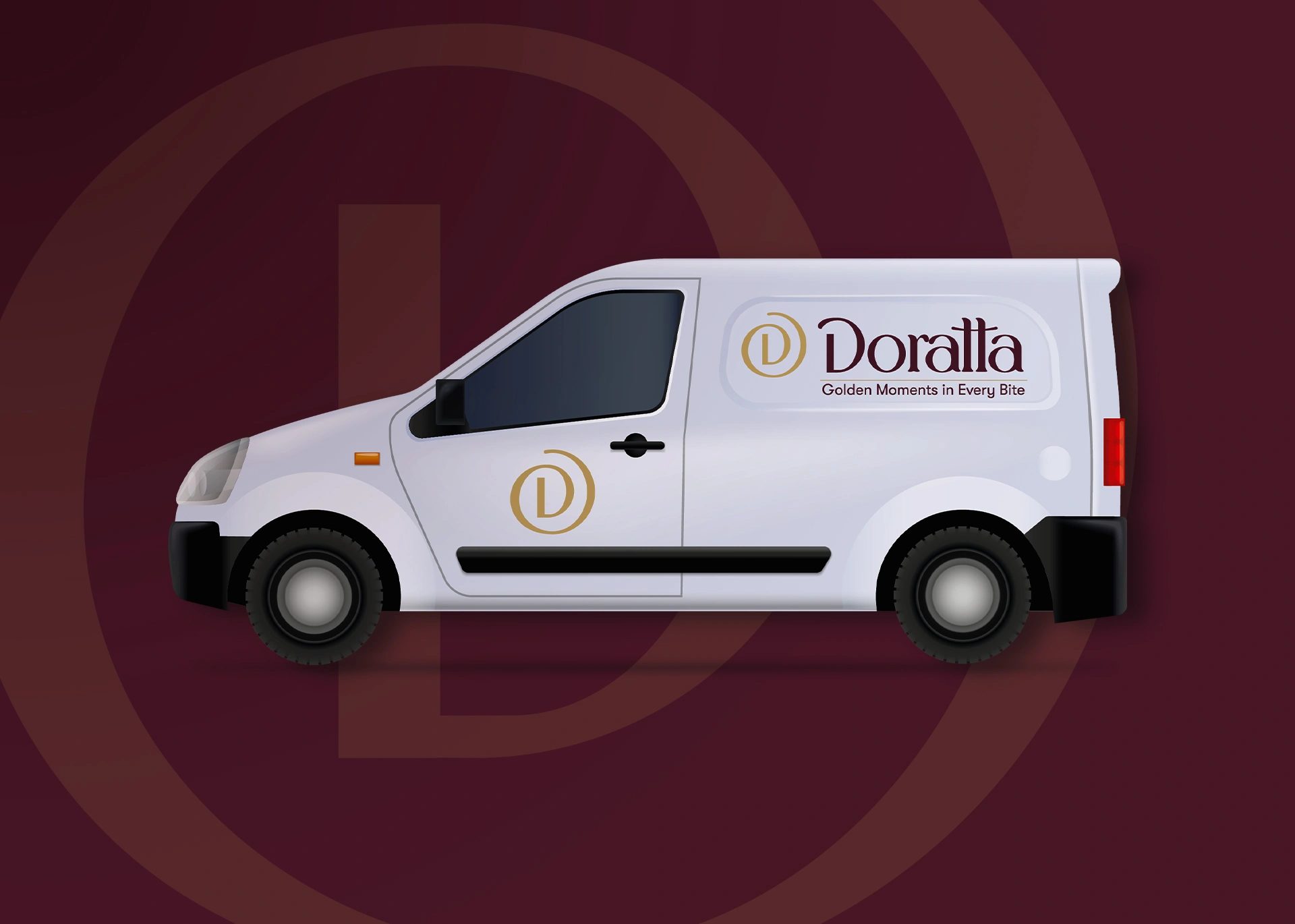
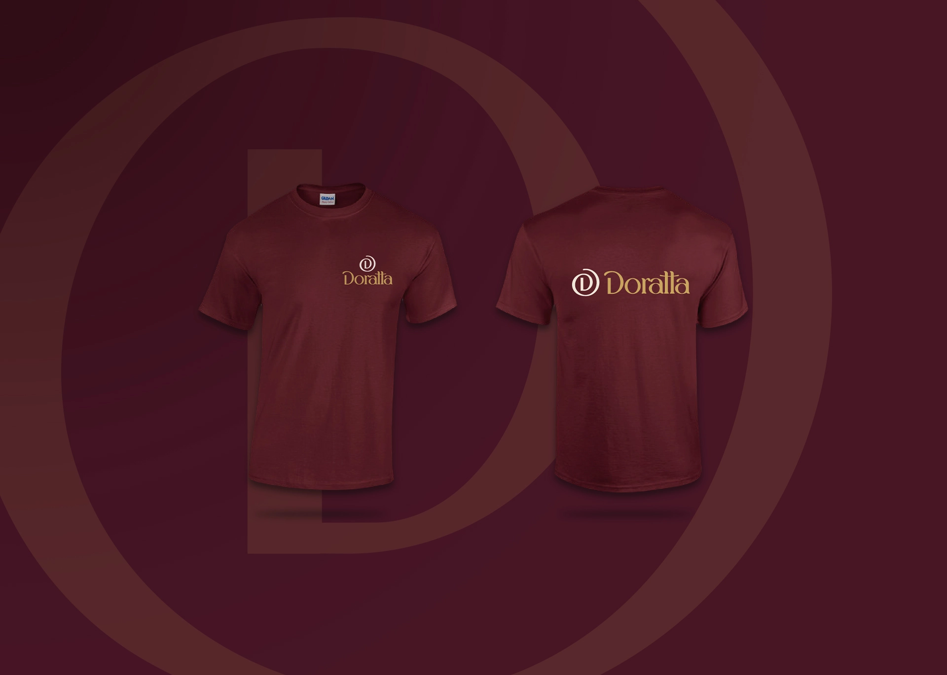
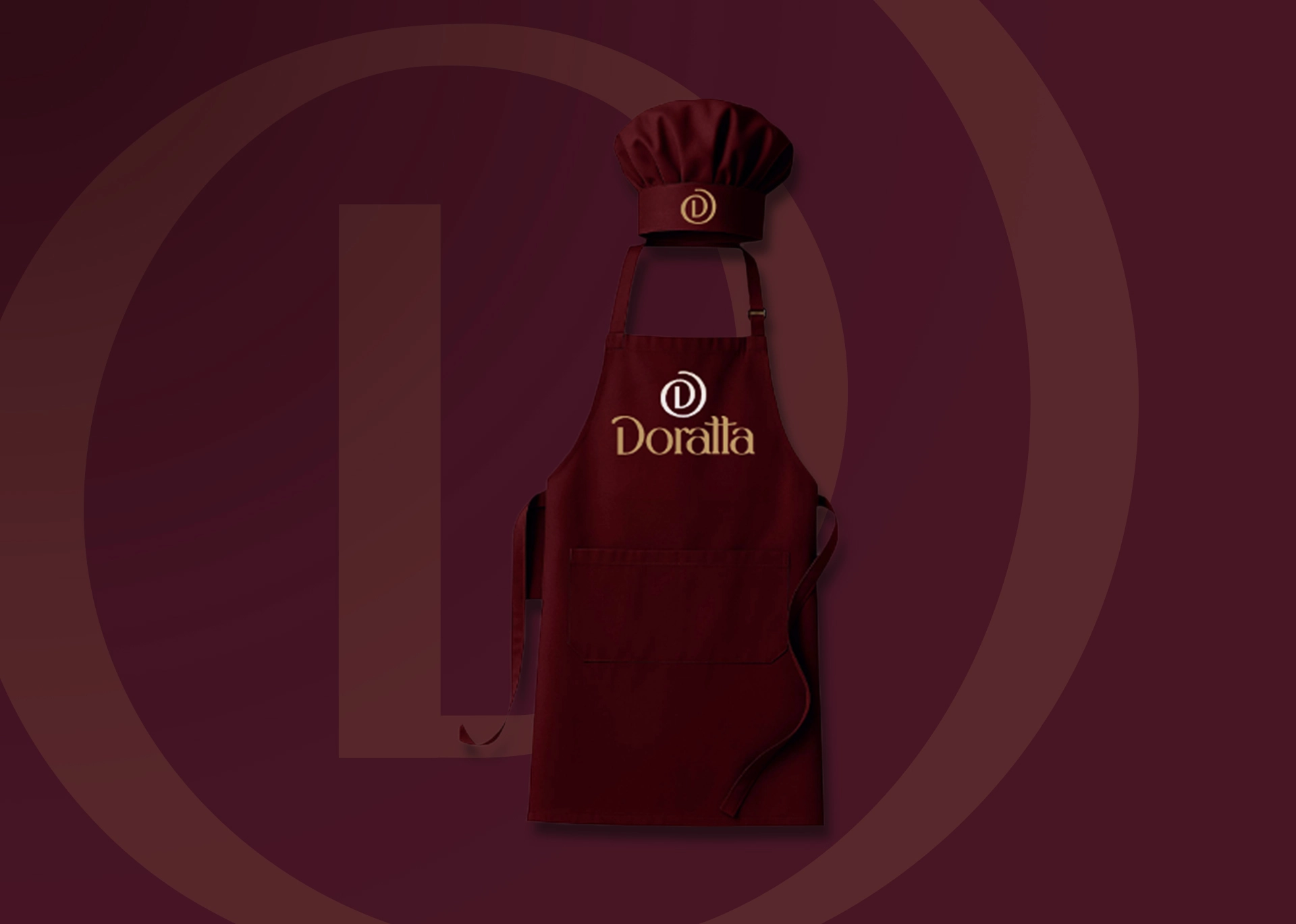
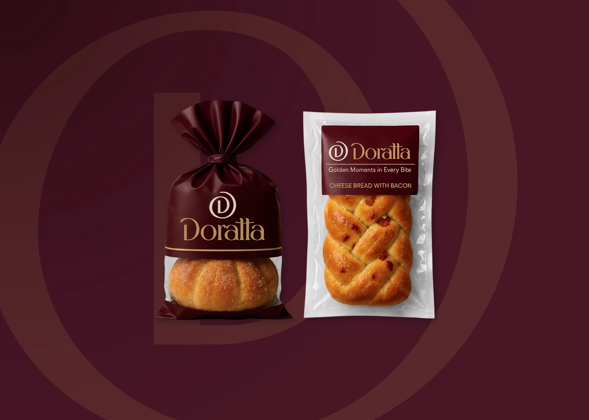
We accompanied the brand from its origin, developing the full strategy, naming (Doratta), concept, and slogan before designing any visual elements. We created a custom typography for the logotype built from scratch and a emblem inspired by the top view of wrapped bread to reflect craftsmanship and care. The brand system was executed across all key touchpoints, including brand guidelines, branded uniforms, custom product stickers, business cards, and nutritional labels.
The result is a brand that transitions from functional to memorable: an identity that transforms the everyday into an emotional experience and elevates artisan bread into something intentional.
Interesting facts
in development
What this project proves for your business:
Strategic naming and positioning create immediate differentiation. Evolving from a generic name into a purpose-built identity gives your business a distinctive voice that commands value and stands out in crowded markets.
Custom visual identity reflects quality before a product is even consumed. Custom typography and deliberate symbol design ensure your brand owns an exclusive visual language that is impossible to replicate.
Consistency across touchpoints builds trust and brand equity. From uniforms to product packaging, a cohesive visual system turns every customer interaction into a promise of design, quality, and care.